Before & After Kitchen Renovation
Jun 02, 2014, Updated May 03, 2022
This post may contain affiliate links. Please see our disclosure policy.
Pin this now to find it later
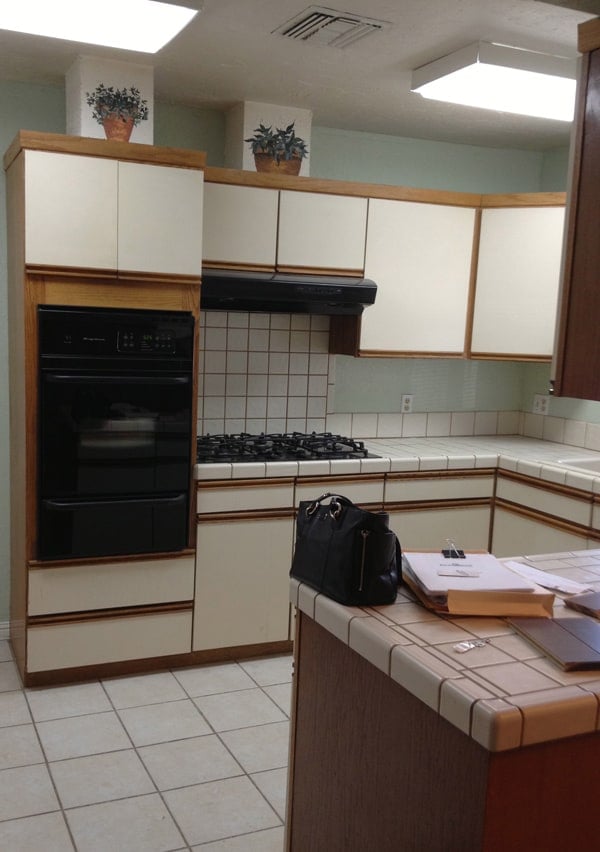
Pin ItLast Friday we were honored to share an exclusive home tour on Emma and Elsie’s incredible blog A Beautiful Mess! So now it’s time to finally post photos of our before and after kitchen renovation! Warning — the before photos are frightening. I mean, I literally cried (not tears of happiness) when we closed on this house. I was nervous to take on this challenge since this was our first home.
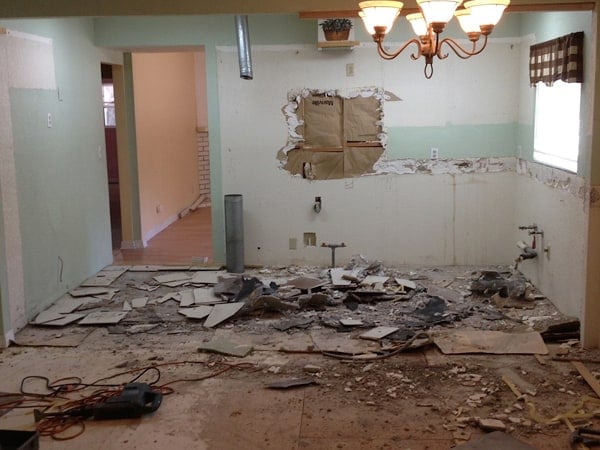
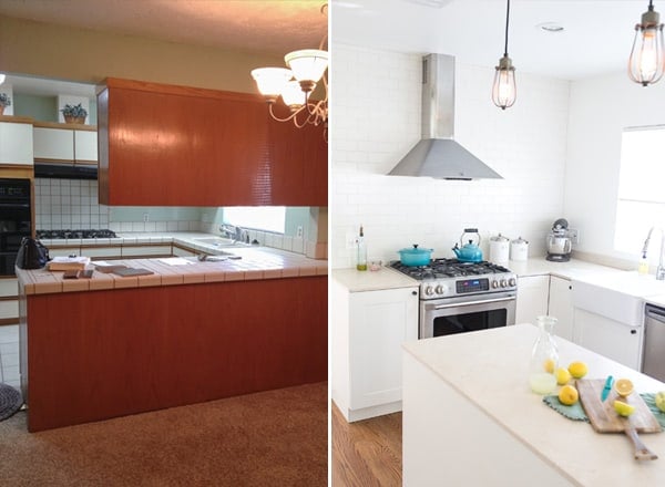
The kitchen was a total disaster! The floors were completely uneven because of bad additions, there were random soffits everywhere, it was dark and the appliances didn’t really work… and the list goes on! We knew we couldn’t do this by ourselves so we worked with an angel contractor, Jerry Siefert, who literally helped us create a dream kitchen on a budget. We had a lot of work to do throughout the entire home so it was imperative we stuck to our budget.
I’m very happy with how it turned out for the price we paid. Below are a few details on products we used and the process.
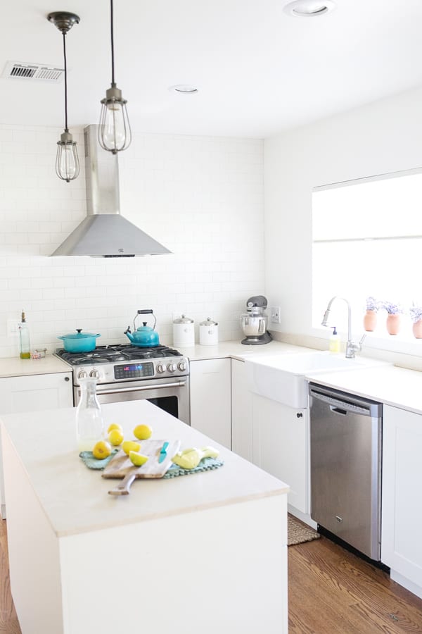
We decided to go with Ikea for cabinets after researching different options and pricing out custom cabinets. The quality of Ikea is surprisingly really impressive and I’m extremely happy with the cabinets! The farm sink is also Ikea… probably the deal of the century since it’s a beautiful sink for an amazing price.
The lighting and hardware are all from Restoration Hardware. Since we saved money on the cabinets I wanted to splurge a little on the hardware. I know the trend right now is gold, but this is an old ranch house and gold doesn’t fit the style of this home, so I went with oil rubbed bronze fixtures. The lights over the island are the Marconi Cage Pendants and we bought two Vintage Barn Pendants to hang over the dining table. For the cabinet hardware, I chose the Lugarno Pull in oil rubbed bronze and the knobs are Asbury.
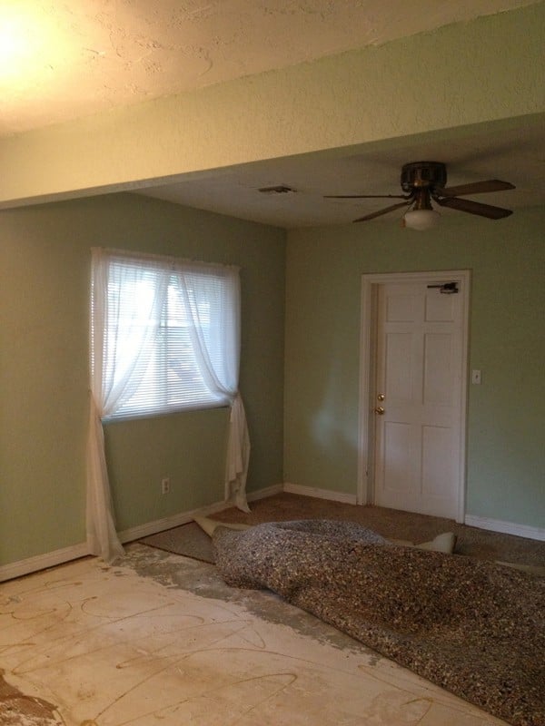
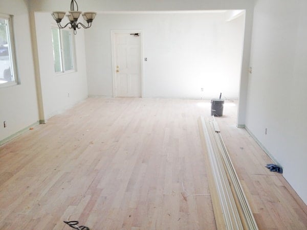
The floors were really bad. Under the carpet in the dining area it was an uneven half slab and half raised foundation with a crawl space. We hired a flooring company to level it out as much as possible by grinding the cement. Then they laid solid oak wood floors down throughout. I chose the Early American color for the stain.
We decided to spend the extra money to smooth out the plaster in the entire house. It was so thick and looked really bad. That gave the house an updated and very clean feel.
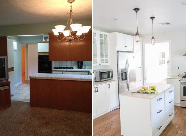
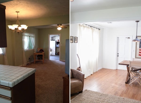
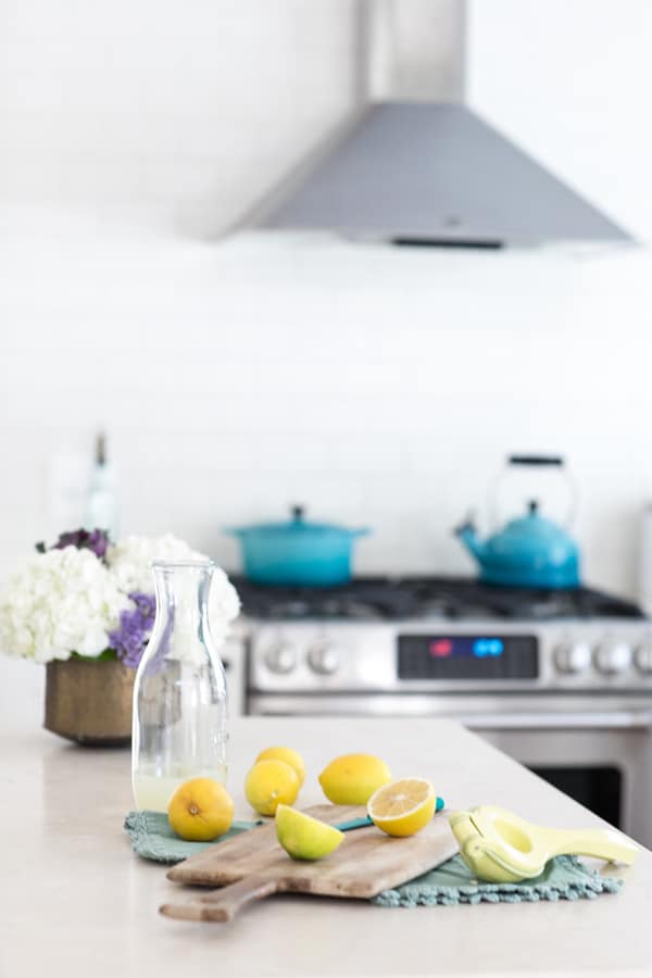
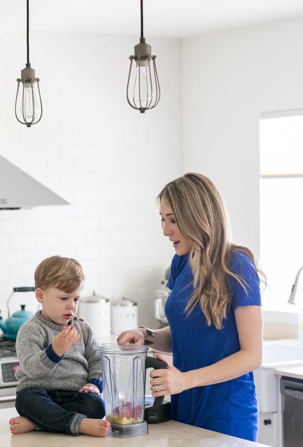
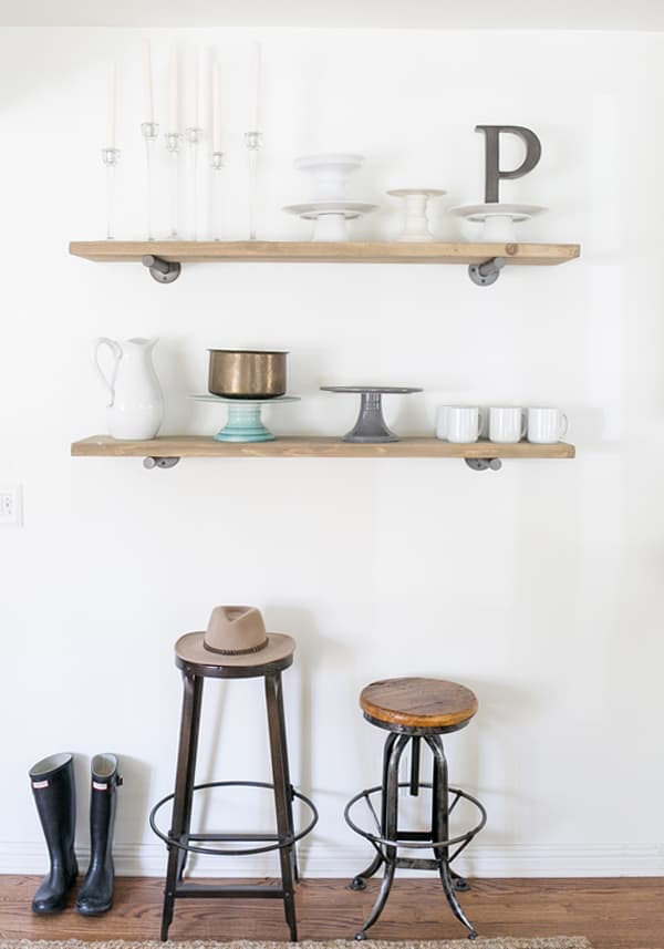
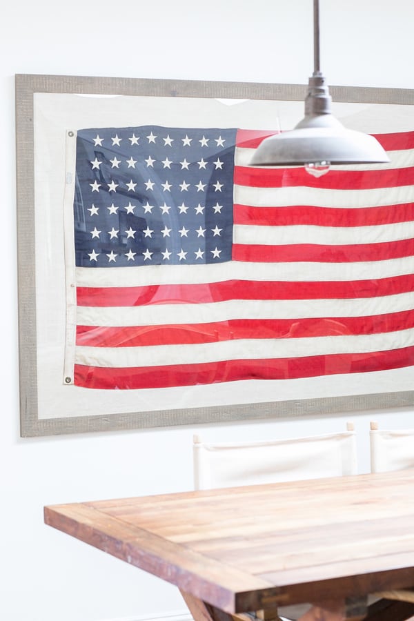
Since it was dark and looked like the Bat cave, we added a skylight in the dining area, which brightened up the entire room and kitchen.
We waited to buy our appliances until there was a Memorial Day sale. So we ended up getting about 30% off of them.




I’m curious. What are the dimensions of your kitchen the before looks very similar to my own kitchen and has the door way in the same spot. Love how you moved the door over for a place to put the fridge
Hi Elizabeth!! So this was our old kitchen, we have since moved so I can’t remember the dimensions. But it was a good size and open. I loved that kitchen! Missing it everyday, hehe 🙂
Hi! Love your reno, I know I am late to the party but saw your post via House Tweaking and had to come over here and check out your blog. Did you guys hire someone to remove the texture from your walls and ceilings or did you do it yourself? Sorry if you’ve already answered this question!
We hired someone to come in and smooth our every inch of the plaster on the walls!! I was not even about to take on that challenge, haha!! It was well worth it too 🙂
Love how light and airy your kitchen is. I am going for a similar look in my kitchen. I love the countertops. Are they quartz? If so, what kind/color?
Thank you Kathryn! The counters are honed marble and I can’t remember the color, but it’s a natural beige color, rather than the usually white marble you see.
Hi Eden-
It was so nice chatting with you guys at Don Cucos. I love your blog! Will be sharing with my friends 🙂
See you around the hood!!
Hi Ximena! You too!! So nice to run into you… your boy was very polite and well behaved… mine on the other hand, haha!!! Thanks for checking out Sugar and Charm too and for passing it along! See you around!!
This is just gorgeous! I love the light and the beautiful simplicity. Ahhhh…my dream kitchen! By the way…in love with your site…I could browse all day!
How much did this approximately cost and how many square feet is your kitchen? We’re looking to do ikea cabinets as well.
Just looked at you blog for the 1st time. Really nice. Is it possible to know where are the shelves from. I love the brackets.
this doesn’t even seem like the same house! what a huge difference,and no cupboards above, i love it! i adore the aqua tea kettle and dutch oven too!
Oh my goodness! That is a stunning transformation! You guys have such great taste! Also do you mind me asking what camera you shoot with? Your pictures are gorgeous. 🙂
What a labor of love, and beautiful outcome!:) This inspires me and makes me want to get on my kitchen renovation plans! Good work!