The Big Reveal: My Kitchen and Dining Room Remodel!
Jul 10, 2018, Updated May 01, 2025
This post may contain affiliate links. Please see our disclosure policy.
We’re so excited to finally share our kitchen and dining room remodel! It took us a while to get here, but we’re living in it now and very happy, considering what it looked like before!
Pin this now to find it later
Pin ItWe bought this little cottage a few years ago because it was on a prime piece of property in a highly desirable area. Although the house needed a lot of work and took us about a year and a half before we could make the renovations, we’re glad we hung in there and it was worth the wait.
We hired architect Greg Coleman to help us with the design and plans and teamed up with my good friend, the extremely talented Sarah Sherman Samuel, to design the kitchen and dining room. Sarah designed the living room in our first house years ago!
She has a seamless way of merging both her style and mine together to create beautiful interiors! You can also see our master bathroom she designed in our cottage too!
kitchen and dining room remodel!
Kitchen Cabinets
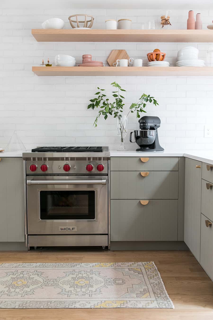
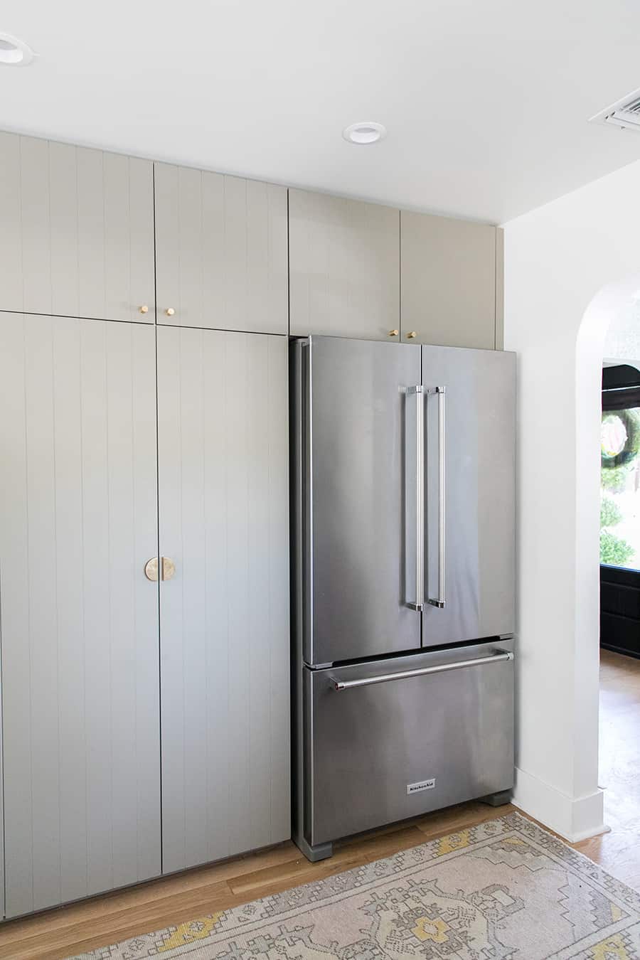
We had used Ikea cabinets in our last home and I was really impressed with the quality and price. This time we used just the Ikea cabinet boxes with the beautiful, custom Semihandmade fronts and I am SO thrilled with them!
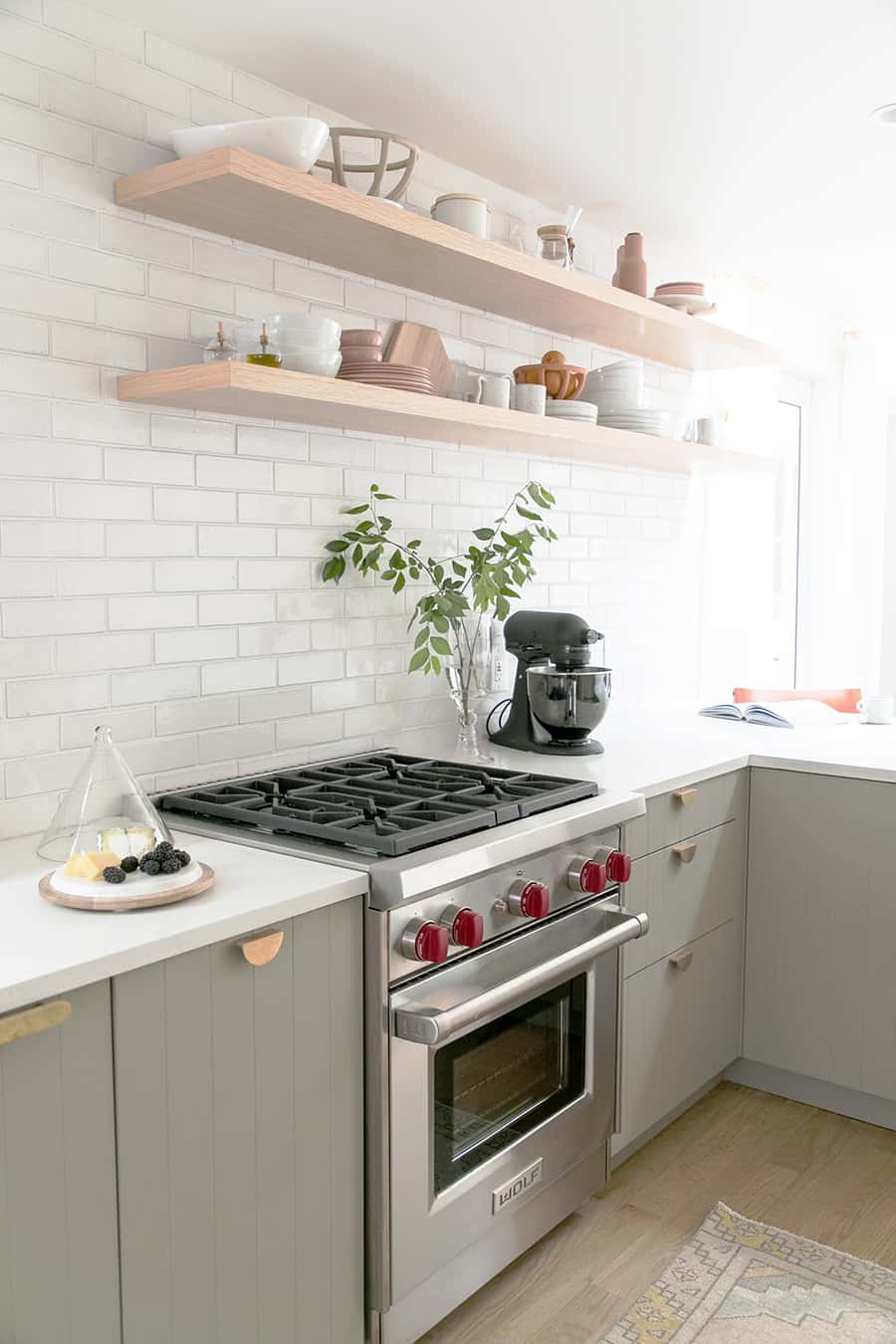
We used Sarah’s SSS Beaded of Semihandmade cabinet doors in desert grey. They’re the perfect style for our modern country bungalow! The finish is matte and cleans up perfectly. I’m honestly so impressed and we absolutely love them.
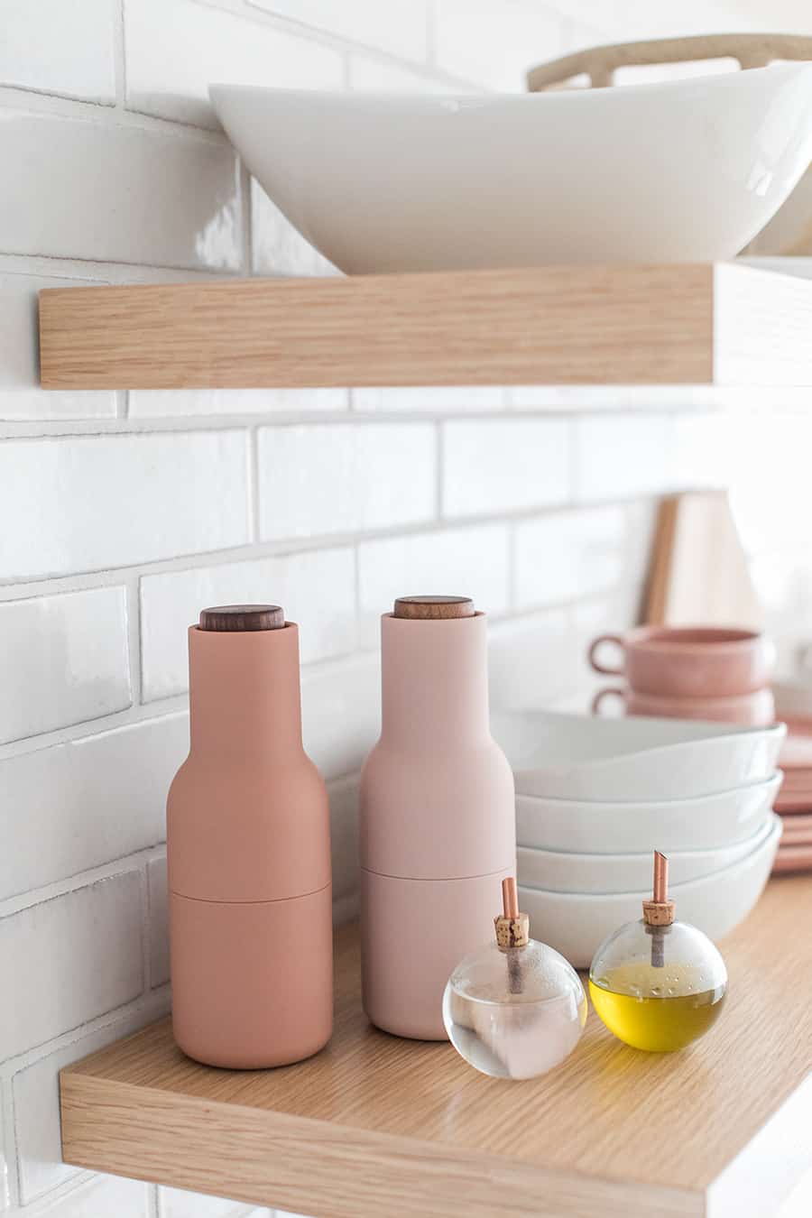
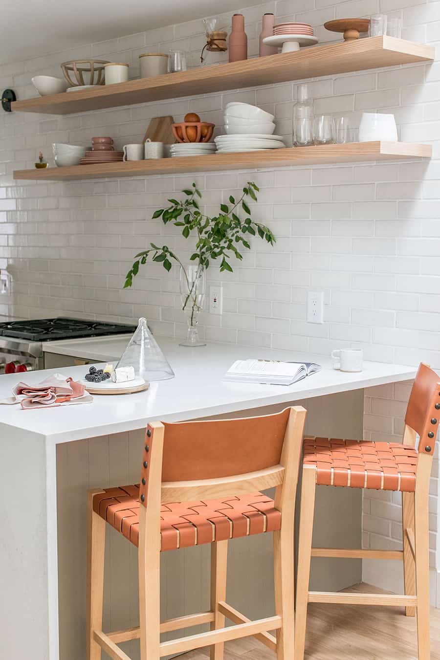
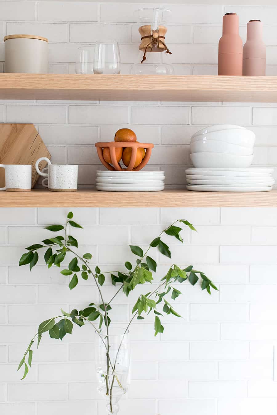
Semihandmade also made us our large, custom Oak floating shelves! They’re 92″ long and we opted to put them over the range rather than a hood… I just couldn’t get myself to bulk up the area with a hood and wanted a cleaner look!
Kitchen Counters
For the counters, we chose Caesarstone in Calacatta Nuvo. I wanted something durable and low-maintenance, with a little variation. I had honed before and it was too much upkeep.
This polished Caeserstone has been an absolute dream in the kitchen, with zero stains and it cleans up perfectly. We actually used it in our master bath too! I love the look of the waterfall edge!
Kitchen Range
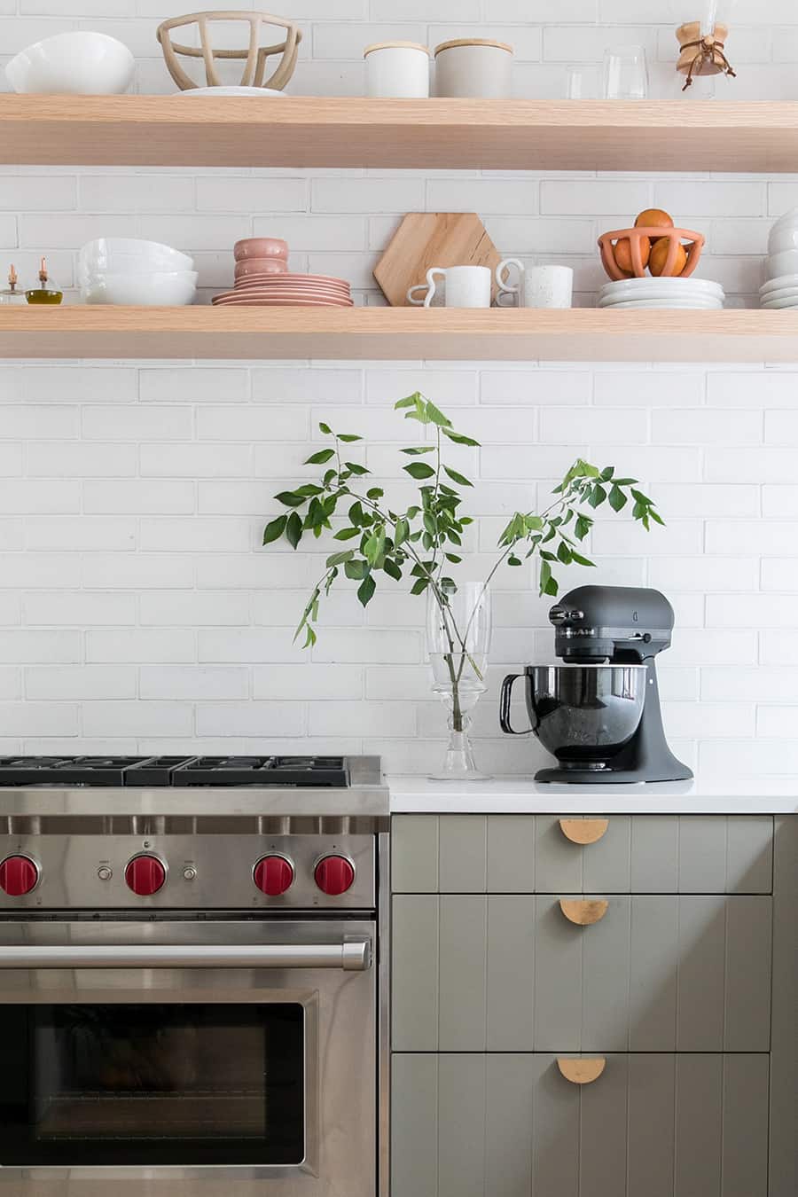
One of the most challenging decisions for me was choosing a range and whether or not we do a range hood or not. After hours of research and shopping in person, I finally decided on the 30″ Wolf range.
I knew I wanted something professional, but I didn’t want a giant range. I was sold on the look, the cast iron grates, consistent heating, rapid boils, and the infrared broiler. There are no bells and whistles… it’s literally four knobs and two buttons, but it cooks amazingly!
As for the hood range, we opted out! I did a lot of research on this and finally saw a few pictures of Tyler Florence’s Wolf Range, sans hood range, and decided to go without it. It’s a large space and I never really used mine too much before… maybe like once or twice a year! All of the surfaces are easily cleanable and so far it’s been great!
Kitchen Tile
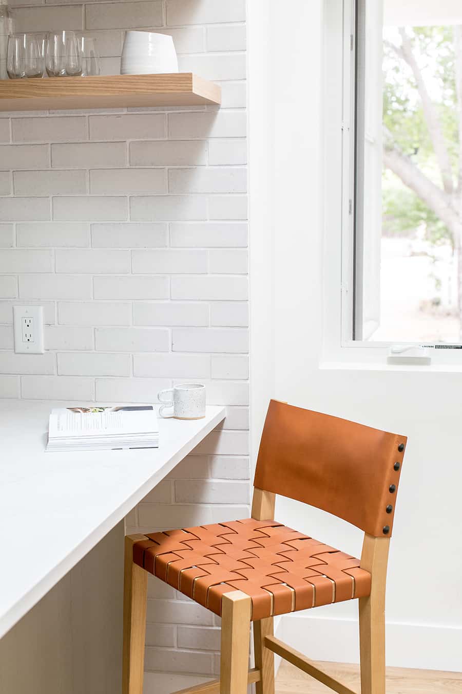
Sarah picked out the most stunning hand glazed brick terra-cotta tile from Fireclay!! I thought it was perfect for our house considering we’re in a ranch area and I like the modern, rustic feel. We tiled one entire wall of the kitchen, from the floor to ceiling!
I love the unevenness and rawness of the tile. The color is Olympic and it has a color variation to it. Everyone comments on how cool the tile is when they walk into the kitchen! I think the feel and look of this tile is unparalleled.
Kitchen Lighting
We used the gorgeous Cedar & Moss, who I ADORE, for the sconces in the kitchen and dining room.
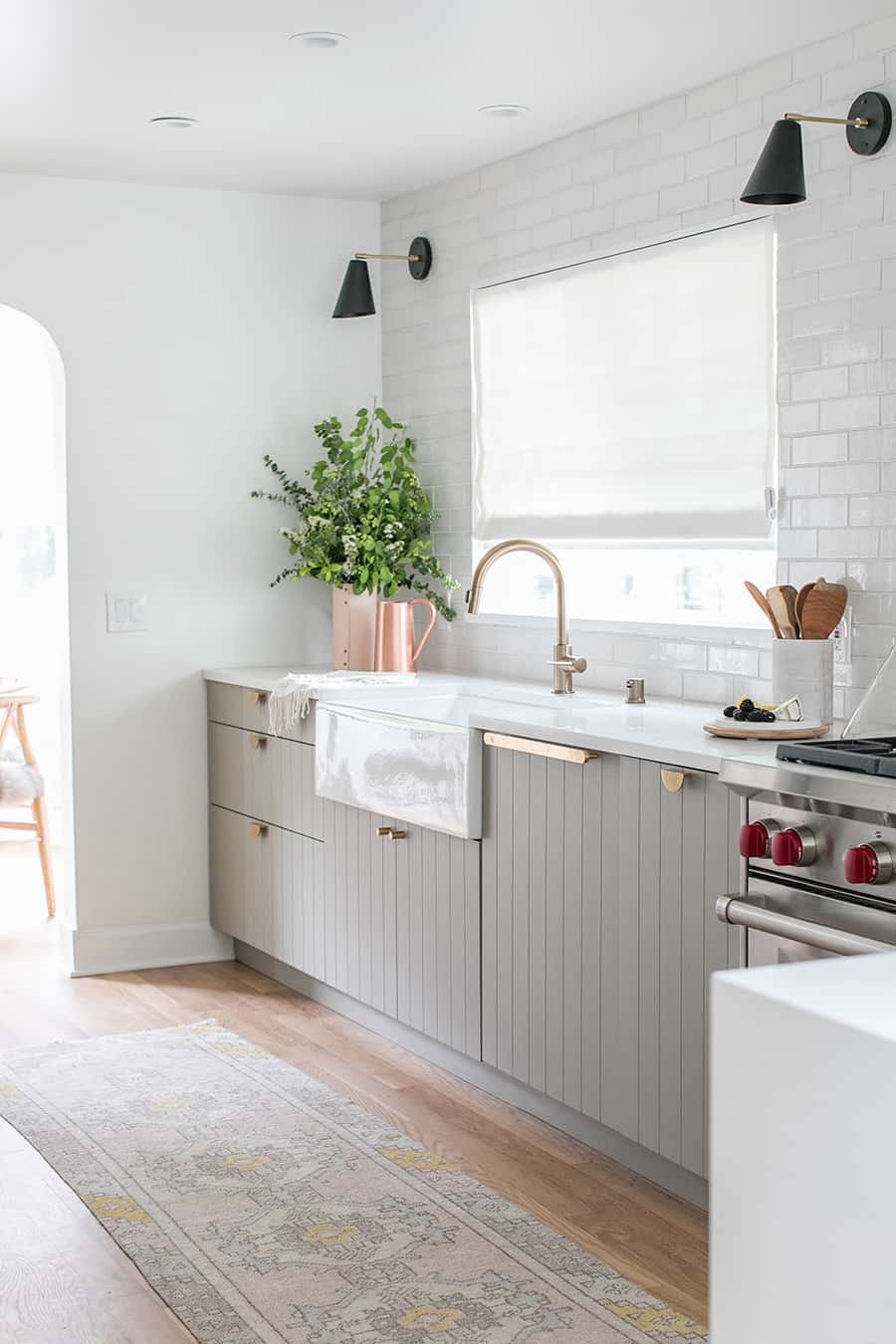
In the kitchen, we used two black Tilt Cones with a brass arm. I’ve loved and admired their work for many years and their designs are classic and beautiful.
Kitchen Faucet
We ordered a brass Delta faucet, you can find it here!
Kitchen Farm Sink
The sink is from Overstock. We customized the Ikea cabinets to fit the long sink and it worked!! I was a little nervous but took the risk because I wanted an extra-large farm sink.
Hardware
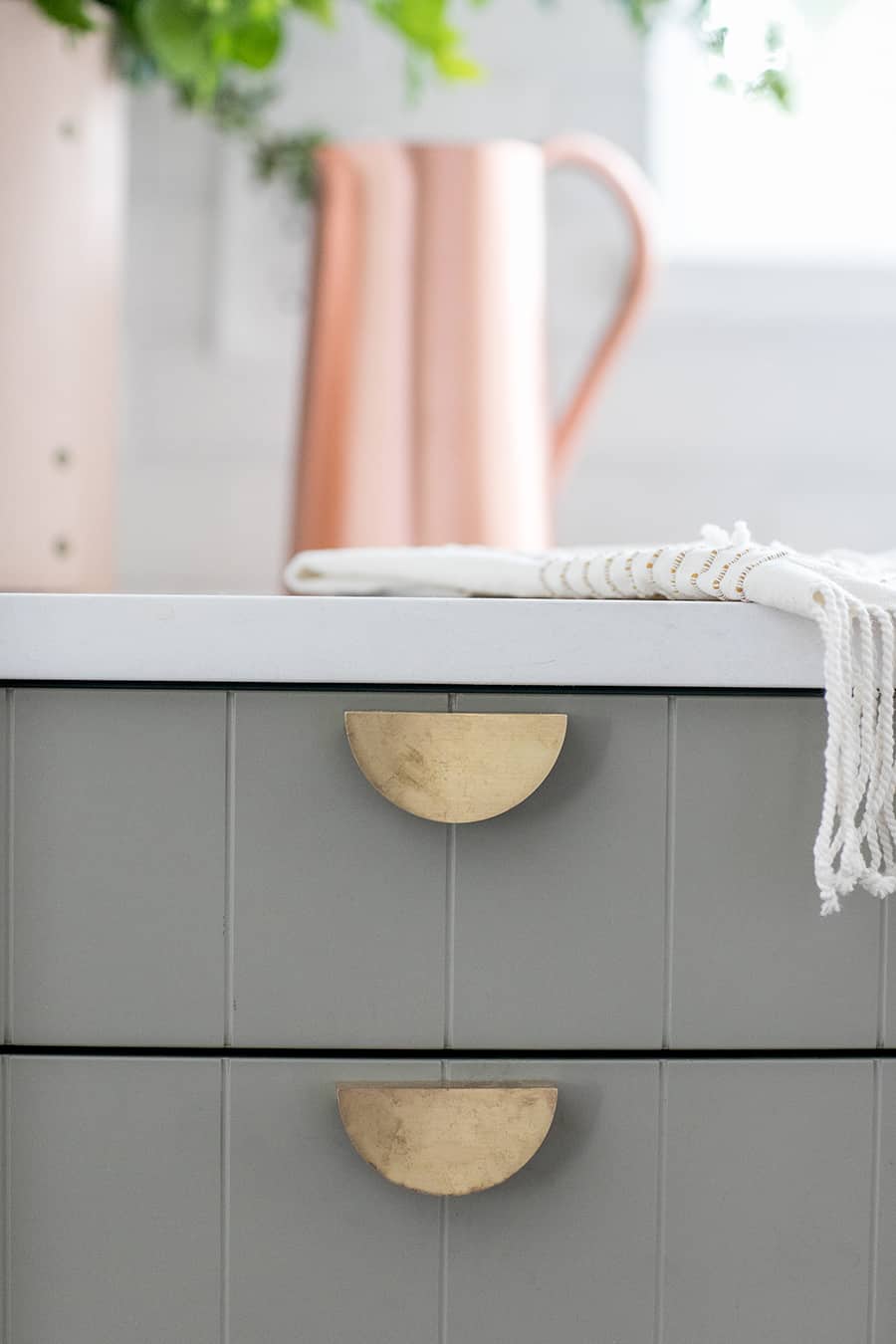
For the hardware, we used Park Studio brass half-moons and the Ottawa pulls, also a fantastic and stunning line Sarah designed!
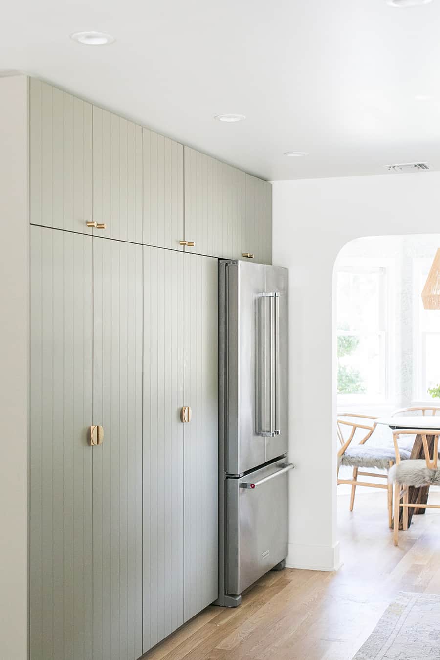
I really adore the entire wall of floor-to-ceiling cabinets. It’s super clean looking and minimal, which is always a good thing. Our awesome architect, Greg Coleman, designed that and it was a nice touch.
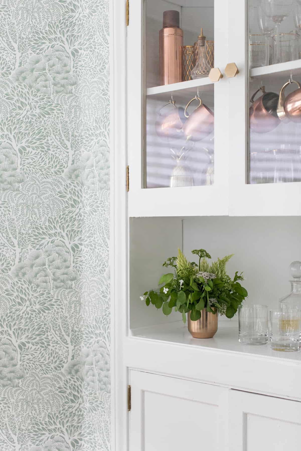
Wallpaper
The original breakfast nook is still a work in progress, but Sarah chose this wall paper for it and what a transformation that made!
We left the original 1930’s hutch and windows. We’re still working on a few other details for this space, but we eat breakfast in here every morning and love it.
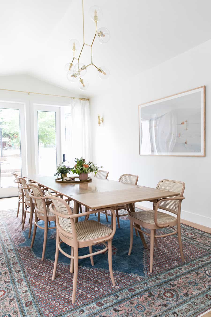
Dining Room
I wanted the dining room to be the focal point when entertaining…an area large enough to have a dinner party and a place we can gather for holidays, parties and meals. Really just an open space to entertain!
We added this area onto the house, since before it was this tiny office room with leaky windows! Our architect added in three sets of large glass French doors and a large window. The space gets so much light! It’s very bright and open.
Dining Room Rug
The statement piece in the room is the large vintage rug from Old New House. Sarah sourced this rug and we’re all in love with it. The colors are stunning and the rug holds up so well. It’s a forever piece that will always live in our house!
Check out their Etsy shop… it’s a family-owned business and they have some of the most gorgeous vintage rugs and have been selling them for generations. Love it!
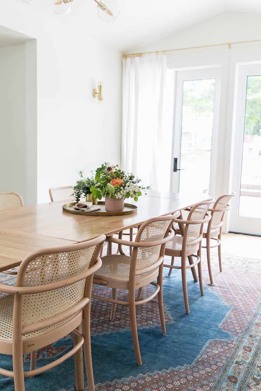
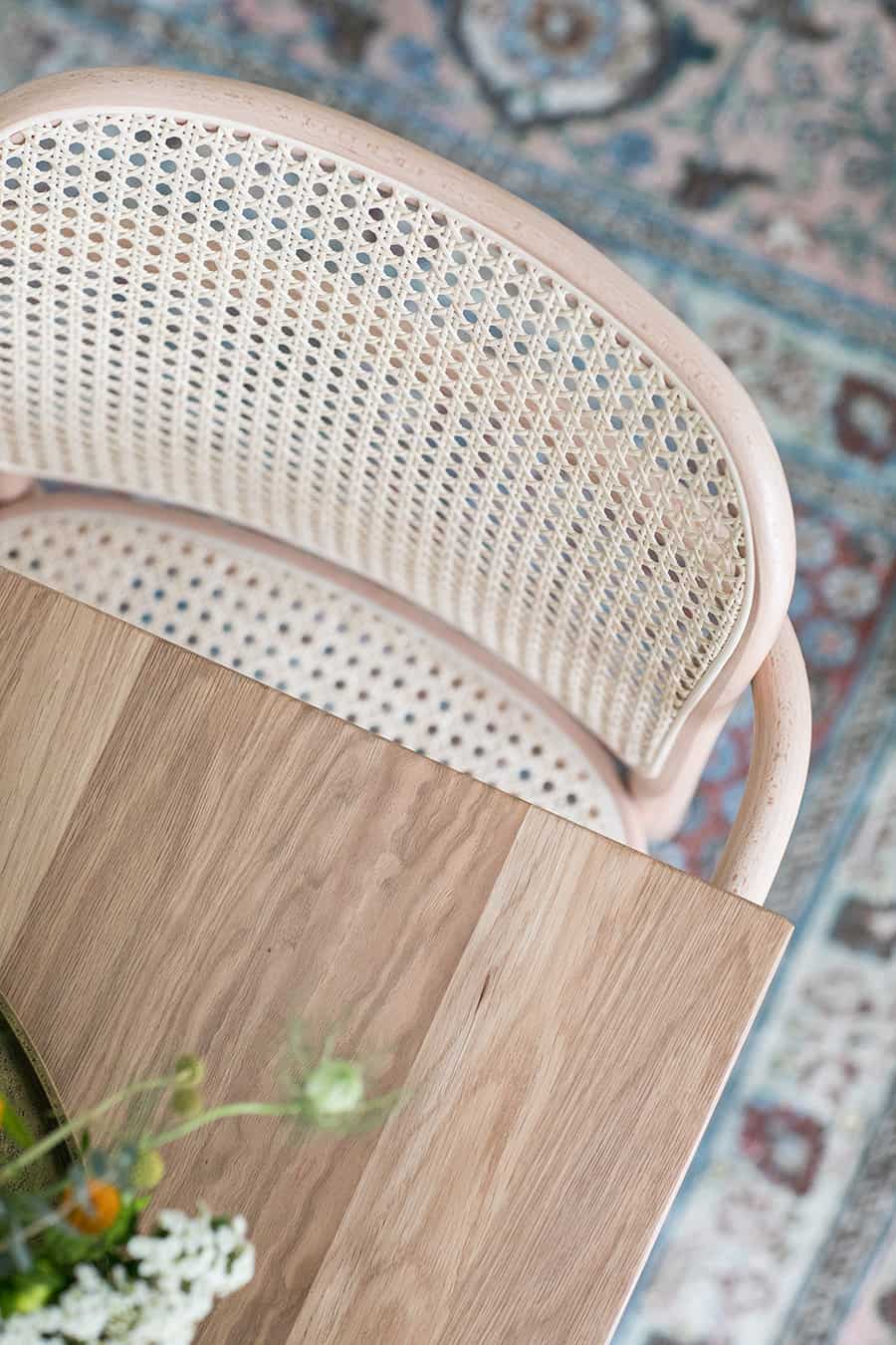
The table is also a favorite of mine… we needed a long table to fit this room and found the perfect one from Article! It’s the Seno Oak table and seats up to 12 people! I also like that it has easily removable extensions if we ever need to make it smaller.
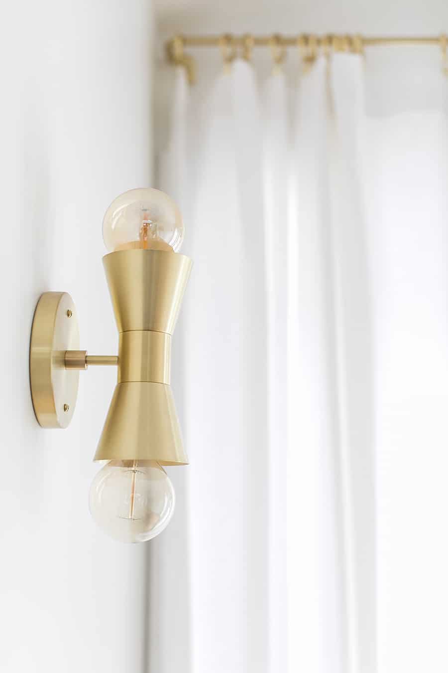
We used four of the brass Mira sconces in the dining room from Cedar & Moss. Love the modern elegance of these and the touch of charm they add to the room!
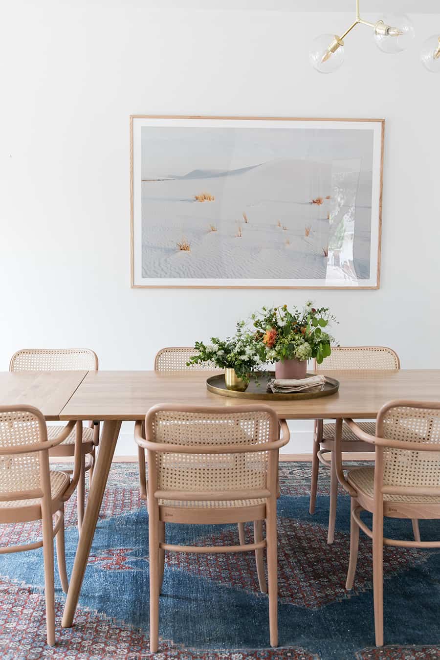
Dining Chairs
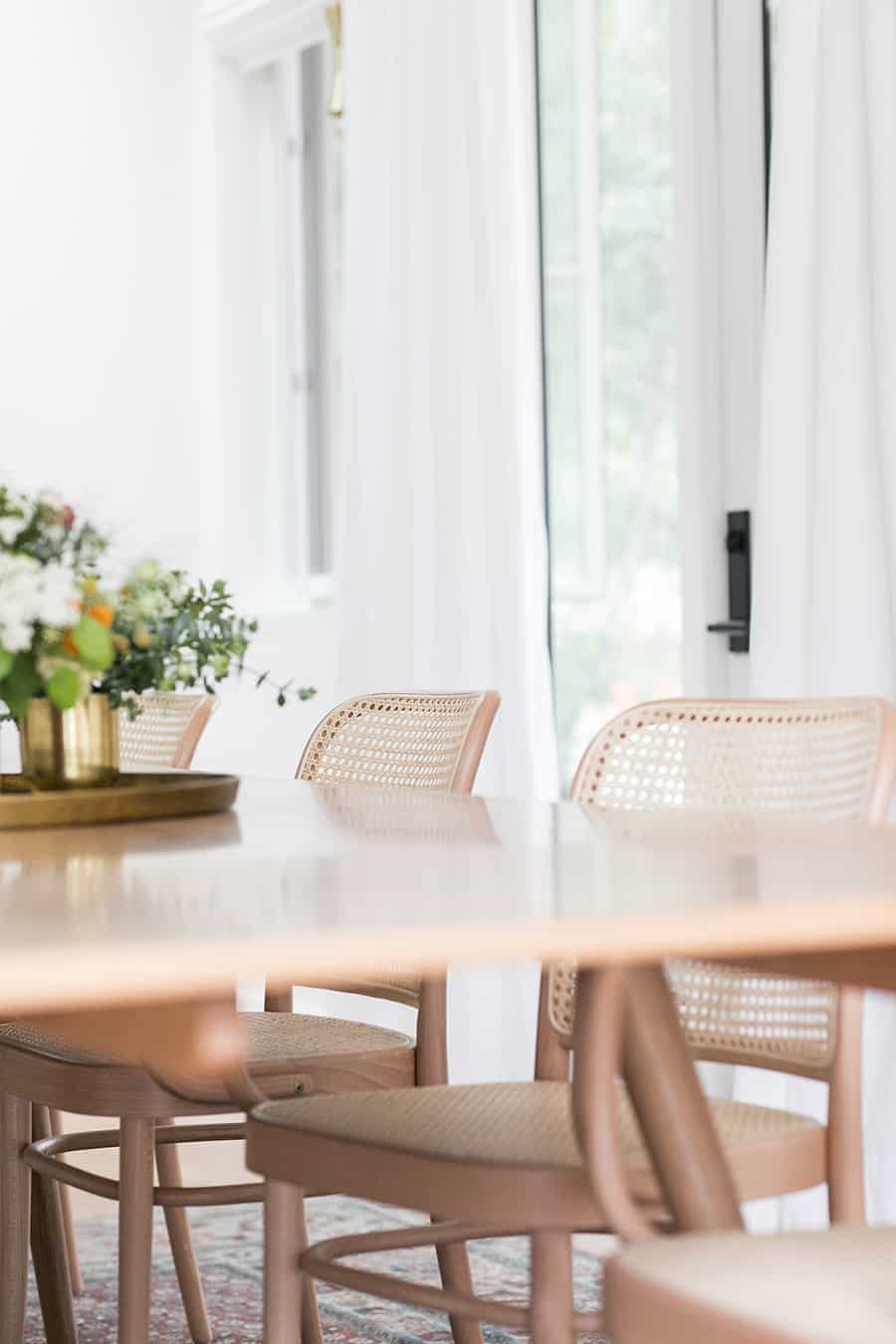
The dining chairs are petite and I adore the design of them. They’re from Design Within Reach.
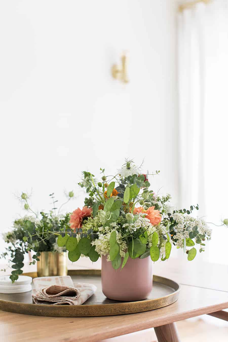
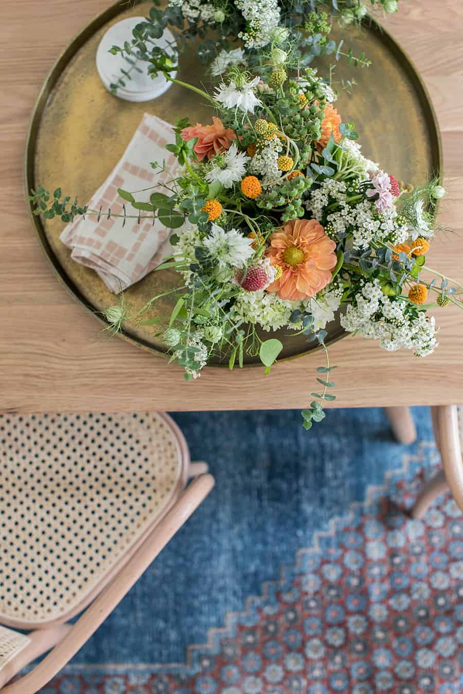
The design of the dining room is very simple and minimal, just the way I like it! I always have fresh flowers on the table to add color and charm and I switch them out via the season! I look forward to sharing more entertaining inspiration and parties in this space with you all!

We had a lot of fun creating this space! It’s perfect for entertaining and our family has enjoyed many holidays and events here. It’s a gathering space that we’ve always wanted.
Let me know if you have any questions about our kitchen and dining room remodel, the design process or items we used.





Love your kitchen!!! Did you have to use custom size tall cabinet doors to line up perfectly with your refrigerator? Thanks!!
Thank you! We did all Ikea cabinets and they are counter depth so the fridge fit perfectly.
Beautiful kitchen! Where are your kitchen bar stools from? They are gorgeous. Perfect in your kitchen. Thank you!
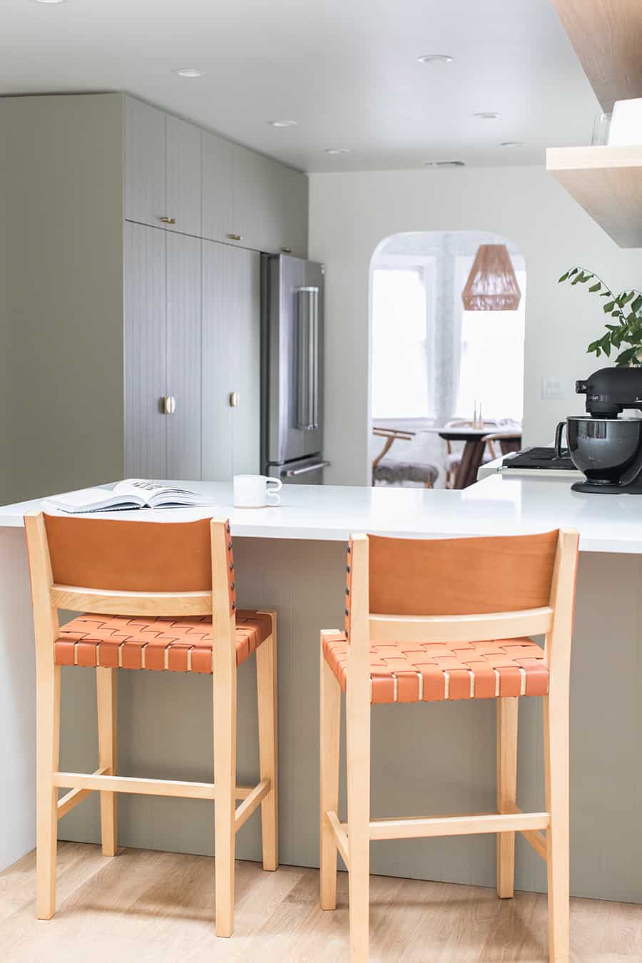
Thanks Jenna! Those stools are form Serena and Lily. They are a few years old now though so not sure they have them in stock.
Hi, very beautiful & fresh looking….what kind of flooring is that in the kitchen?
Thank you! It’s a natural oak floor!
Where did you find the picture in the dining room?
It’s from Urban Outfitters! Super affordable 🙂
Looking sleek and beautiful!
May I ask did you repaint the cabinet?
I couldn’t find the color you have on Ikea website.
Hi! So we used Ikea but we ised Semihandmade for the actual cabinet fronts. We used these in Desert Grey https://www.semihandmade.com/pages/designer-collections
Love all the choices you made. Can I ask which kitchen faucet you chose? Thanks!
Thank you! Here is a link to the faucet https://amzn.to/2tGYk7x 🙂